

Objective
Enhancing product discovery & app navigation
Rebuild Lenskart's app experience from a widget-dumping ground into a product with intentional hierarchy, measurable discovery, and design that earns its place in every session.
Industry
E-commerce | Eyewear
SERVICES
Product Design | UI UX | Visual Design
Deliverables
Mobile App
Impact
+20% CTR · 2× conversions · +80% online business growth


Original Designs
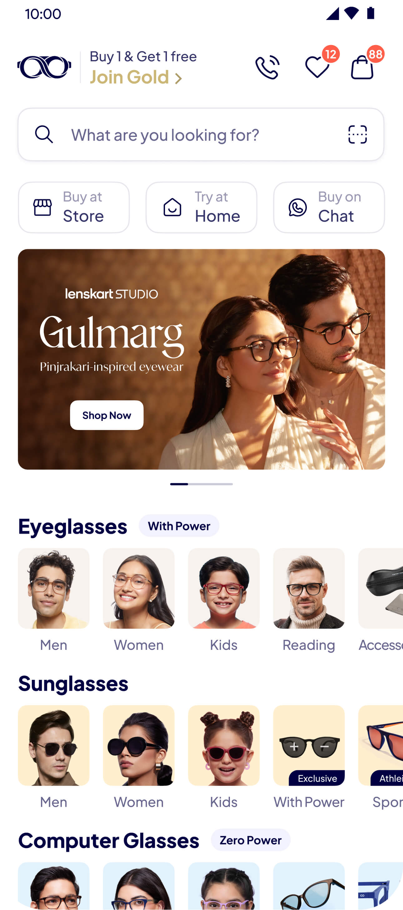
The starting point — a basic app driven by business demand, not user behaviour.
When we joined, the app was functional — but barely intentional. Widgets placed on business demand, banners without hierarchy, no design system, no discovery logic. Everything was image-based and PM-driven.
Key Research Findings
These findings came from two sources running in parallel — behavioural analytics reviewed weekly across lakhs of users, and intermittent user interviews conducted in-office and at Lenskart stores.
Navigation Structure
Small, dense widgets overloaded choices
Poor categorisation & hierarchy made browsing inefficient
Lack of personalisation forced manual navigation
Interaction Patterns
Horizontal scrolls had low engagement
Larger, bolder widgets outperformed others
Engaged users scrolled deeper into the page with intent
Content Clarity
Unclear product value & USP confused users
Lack of visual storytelling around products complicated discovery
Brand terms didn’t align with user search behaviour
Addition of Reels & Stories
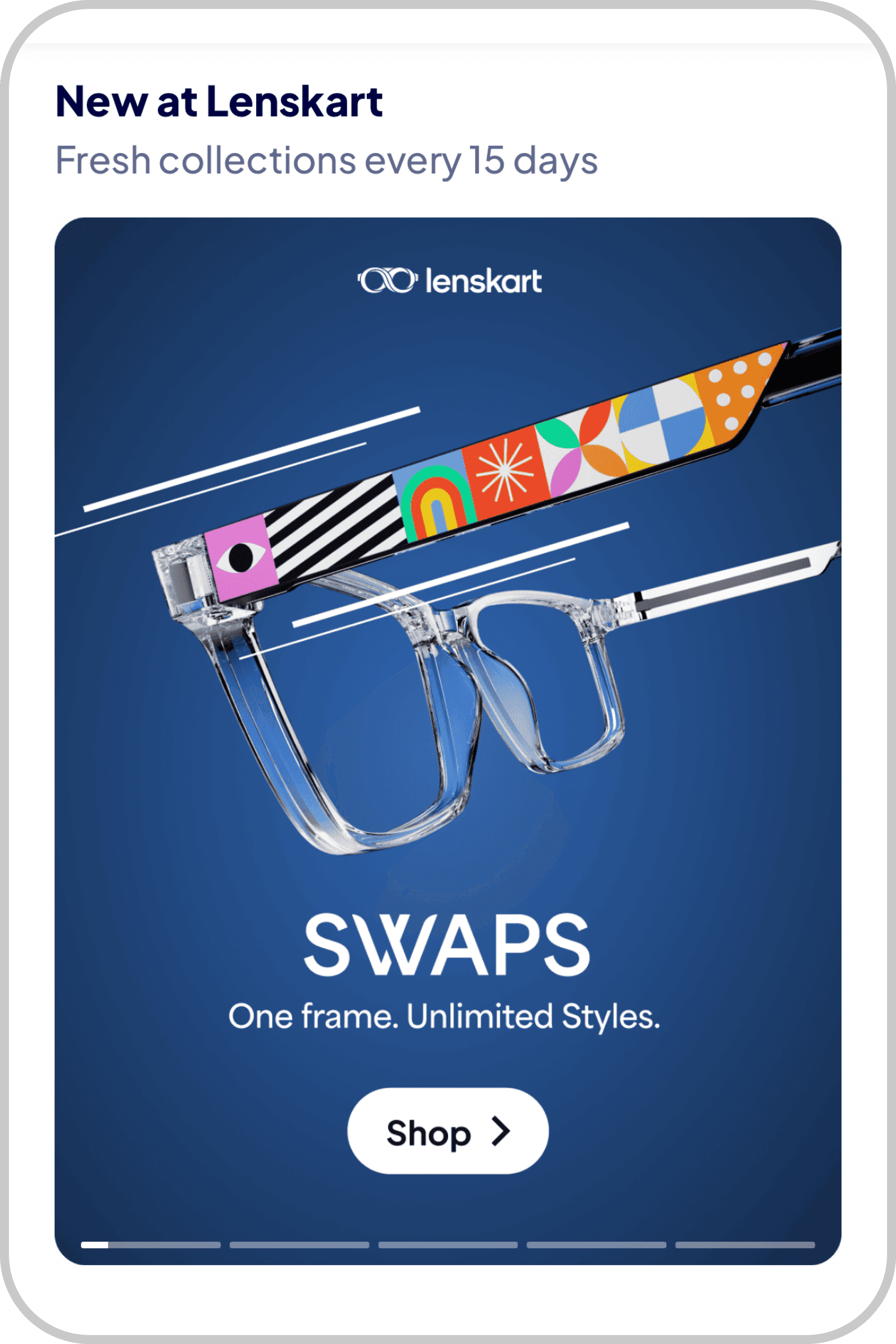
Short videos and statics with engaging, immersive format that helped users grasp the ‘why’ behind products, increased engagement and nudged them toward confident purchases. This was ideal for lightweight storytelling around newer or feature-rich collections.
System architecture — how Reels and Stories were designed to connect across every surface in the app


Introduction of Tabbed Navigation
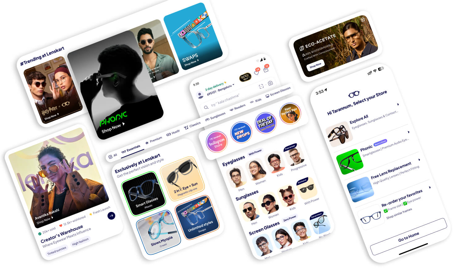
We simplified product discovery for browsing by budget or intent through quick-access tabs. This reduced friction by surfacing the right products early. We chose a horizontal tab layout placed just below the header for maximum visibility and ease.


Each tab surfaces a different intent — but the same component library runs underneath. Below: how the system adapts across Premium, Classic, Essentials, and category-specific views.

Collection & Landing Pages
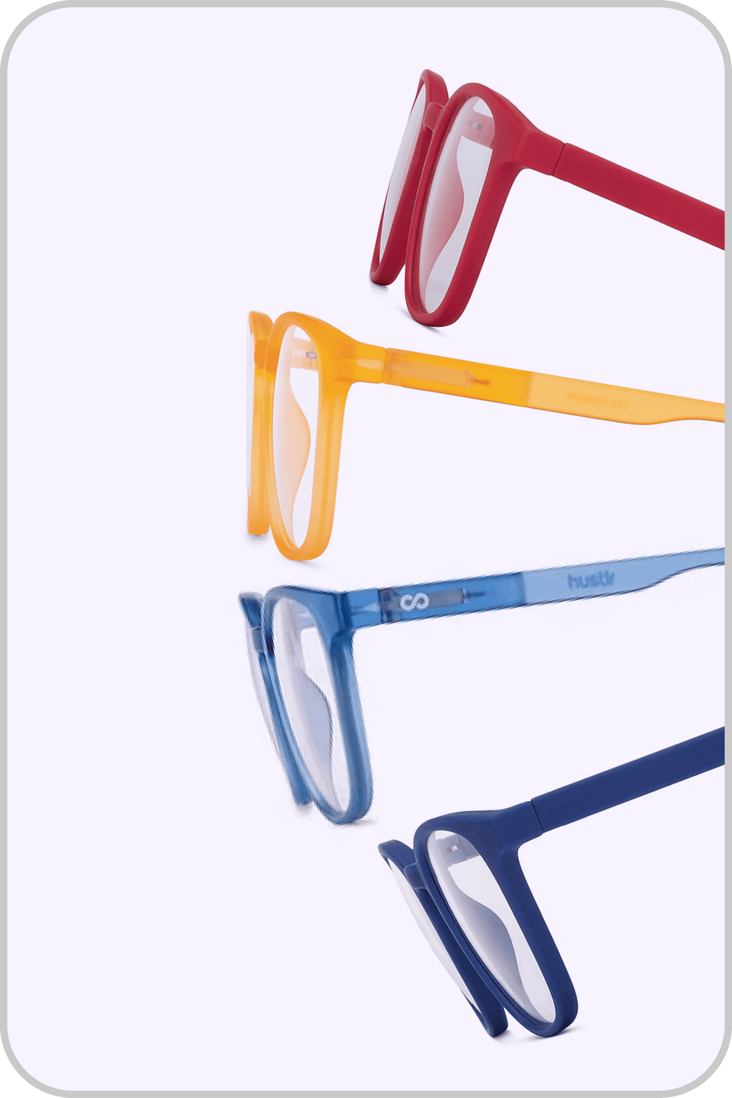
Each landing and collection page was crafted to tell the story of a collection—combining branding, features, and product depth in a single experience.
Product pages were generic and interchangeable — no sense of collection identity, no storytelling layer. We rebuilt each one to carry its own visual narrative while staying within the system.
Pre Home: Start Screen
As features were added, we introduced a focused entry screen to guide users based on intent. Pre-Home was designed to surface relevant paths to align with user intent and enable personalised content to add structure to the journey and improve discoverability.
Pre-Home was a deliberate experiment — and one I had reservations about from the start. Adding a decision screen before the homepage adds friction before the user has seen anything worth staying for.


Home Page
Each modular intervention—Reels, Stories, Tabs and Pre-Home—was a step toward reimagining the homepage. By observing user behaviour and layering features, we evolved the layout and hierarchy to reduce cognitive load, improve relevance, and guide users more intuitively through the app.




Outcomes & Reflection
No single feature drove these numbers. It was the compound effect of fixing what was broken at every layer — architecture, navigation, discovery, and content.
+20%
CTR increase
x2
Conversions
+30%
Return Users
80%
Online business growth
Over the years, we moved from a widget-dumping ground to a product with intentional hierarchy, measurable engagement and a design team with real influence over business decisions. Some things worked immediately— tabbed navigation, collection pages, the homepage restructure. Some things didn't— Pre-Home, Phase 2 tabs— and we pulled them quickly. The 80% growth in online business is the number I'm most proud of, not because design alone drove it but because it happened in a period when design went from being an afterthought to being in the room where product decisions were made.


