

Objective
Designing for Decision, Retention & Loyalty
Closing the gap between browsing and buying — helping users make confident purchase decisions, reducing friction along the journey and building brand loyalty
Industry
E-commerce | Eyewear
SERVICES
Product Design | UI UX Design | Growth & Loyalty
Deliverables
Mobile App
Impact
2× conversions · 40% reduction in dropoffs
Product Details Page (PDP): Designing for confidence
The Opportunity
The PDP had the fundamentals covered, but shopping for eyewear is inherently visual and contextual. Users needed more than specifications—they needed to see how a product looks, understand what makes it different, and imagine themselves wearing it.
MY role
As part of the PDP revamp, I worked across the team to introduce richer, more contextual ways to evaluate a product. Real people wearing it, styling it in context, and understanding its details up close."
Objective
How might we help someone picture themselves in a product?

01
See it on real people
Static product photography answers “what does it look like?”
Video content helps answer “what could it look like on me?”
A video-first inspiration layer featuring creators, influencers and campaign shoots was incorporated, giving users a more contextual view of the product before making a purchase decision.

02
From inspiration to possibility
Seeing a product on someone is useful. Seeing how it can fit into different styles and occasions takes the decision one step further.
A visual bento grid was introduced that showed the same product across different outfits, settings and styling directions — helping users imagine how it could work in their own wardrobe.
03
Relatable product details
Important specifications were often buried within conventional product information. This was put into interactive feature boards that turned key attributes into visual, digestible moments.
Material. Weight. Lens technology. Construction. Features.
Instead of asking users to read through specifications, the boards let the product explain itself visually.

The Opportunity
Choosing a frame is intuitive. Choosing the right lens is not.
The previous experience compressed power selection, lens options and prescription details into a single screen, leaving users to navigate a complex set of choices with limited context.
How might we
How might we simplify a complex lens decision into a guided journey, giving users enough information and confidence to make the right choice?

From one dense screen to a guided journey
I worked with the design team to restructure lens selection into a three-step flow: Power Type → Lens → Add Power. Breaking the journey into clear stages gave users a sense of progress while allowing each decision to be explained at the right moment.
Loyalty: Building reasons to buy, return & stay
The Opportunity
Turning membership from a discount proposition into a reason to choose, buy and return.
As Lenskart’s membership ecosystem evolved, I worked on experiences that made higher-value memberships more compelling while removing friction from key membership benefits.
MY role
worked across the Gold Max and Gold First experiences, from shaping value propositions and landing pages to designing new membership features and their supporting touchpoints.


Turning membership into an acquisition lever
Gold First was introduced as a limited-time membership exclusively for new users, using a simple proposition — Your first frame is free — to turn membership into a reason to make the first purchase.
I designed the membership experience to make the offer easy to understand and give users a clear path from discovering the offer to becoming a member.
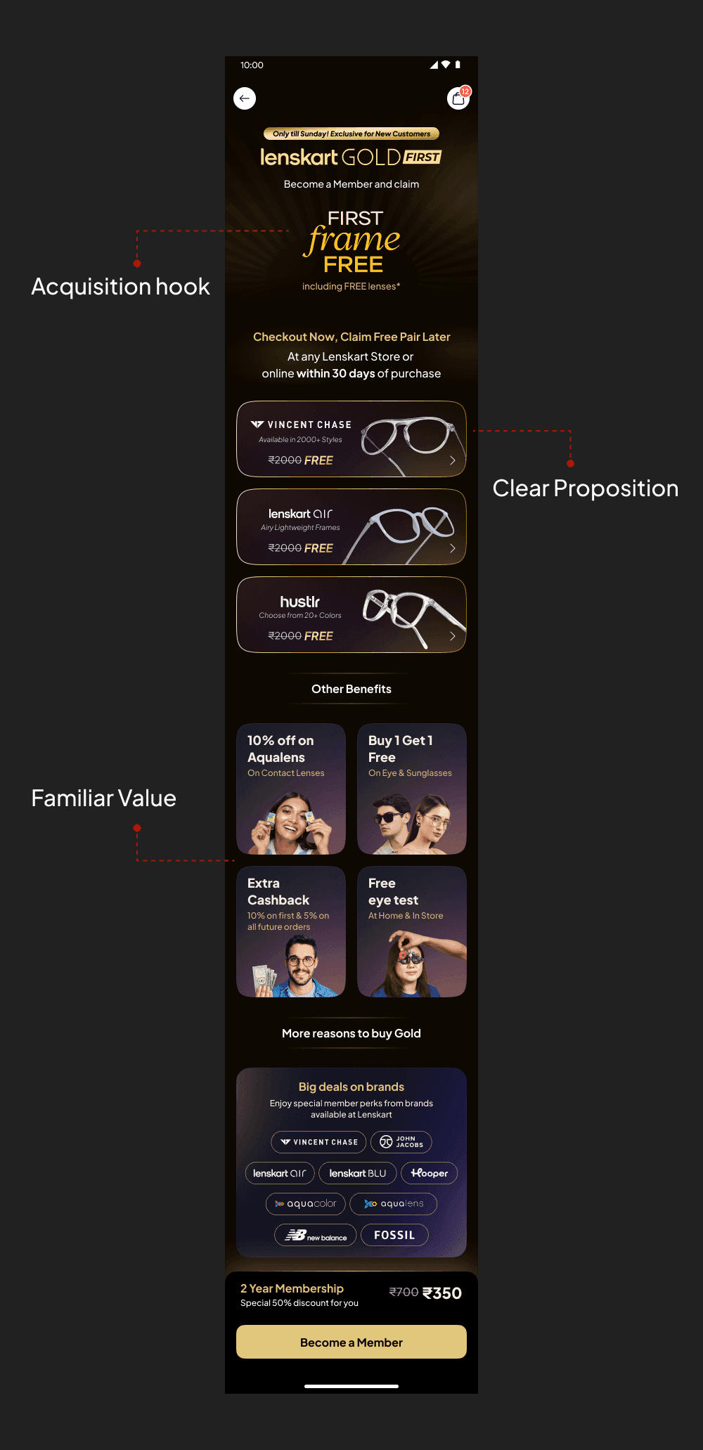
I worked on two paths to accommodate this:
Buy now, claim later: Users could purchase Gold First without selecting a frame and claim their free frame within 30 days.
Buy with a frame: Users who were ready to shop could purchase the membership alongside their frame and claim the benefit immediately.
This allowed us to capture the membership conversion without making product selection a prerequisite.


Higher value, higher acquisition
Gold Max was introduced as a second tier above Gold, offering additional value through Extra Cashback and a more flexible B1G1 benefit.
I worked on the Gold Max proposition and landing experience, making the added benefits easy to understand while introducing Buy 2nd Later to give members more flexibility in using their B1G1 benefit.
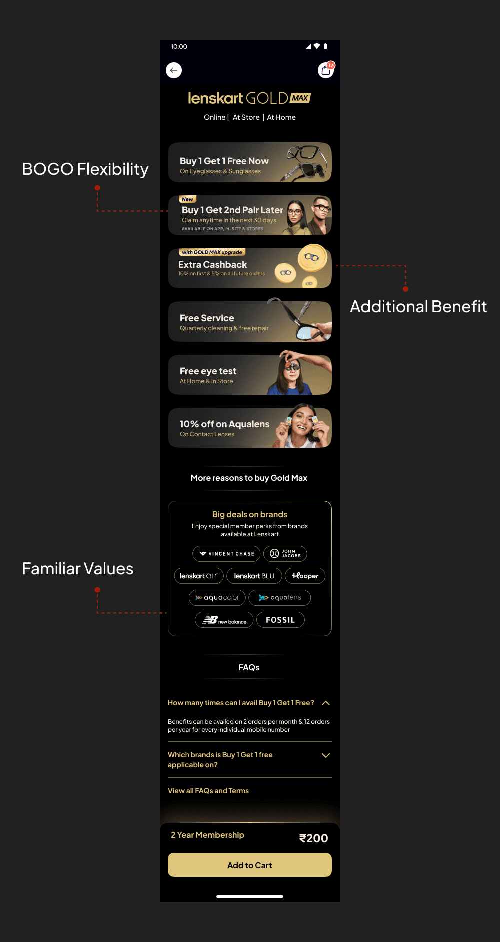
Buy 2nd Later — removing the pressure to choose twice
With B1G1, users had to find two products in the same purchase to fully use their membership benefit. We noticed that the second choice was becoming a point of friction — users were dropping off because finding a second pair was turning tedious. They wanted the membership and first frame but weren't necessarily ready to find another product at that moment.

Outcomes & Reflection
No single feature drove these numbers. It was the compound effect of fixing what was broken at every layer — architecture, navigation, discovery, and content.
+20%
CTR increase
x2
Conversions
+30%
Return Users
80%
Online business growth
Over the years, we moved from a widget-dumping ground to a product with intentional hierarchy, measurable engagement and a design team with real influence over business decisions. Some things worked immediately— tabbed navigation, collection pages, the homepage restructure. Some things didn't— Pre-Home, Phase 2 tabs— and we pulled them quickly. The 80% growth in online business is the number I'm most proud of, not because design alone drove it but because it happened in a period when design went from being an afterthought to being in the room where product decisions were made.


